Iron LA · Fitness & gym
Iron LA gym website with training programs and club story
Techcelerant built the Iron LA gym website with training programs, personal training, facility pages, member stories and the history of the club.
First published
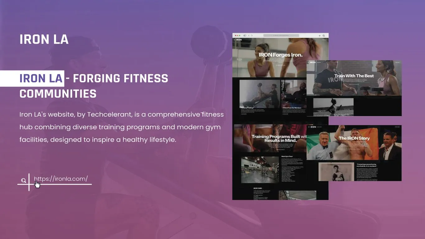
Iron LA is a gym in Los Angeles with roots in boxing. Techcelerant built its website as a full fitness hub: it covers the training programs, the trainers, the facilities and the story behind the club. The site is built to make people want to train there and to give them every detail they need before their first visit.
The client
Iron LA offers strength training, conditioning, personal training and boxing in a serious, well-equipped space. Its members range from people who lift every day to fighters and people taking their first class. The gym has a long history in the boxing world, and that history is part of why members choose it.
The problem
Gym websites tend to look the same: a stock photo, a list of classes and a pricing table. Iron LA has a strong identity, and a generic site would have flattened it. The gym needed a site that felt like walking onto its floor.
It also had a lot of information to share. There are several training programs, a team of trainers, more than one training area and a long story in boxing. Visitors had to find the part that mattered to them, whether that was a program, a trainer or the facility, without wading through the rest.
What we built
- A homepage that opens with "IRON Forges Iron." over a photo of members training, followed by blocks for personal training and member stories.
- A "Personal Training" section that explains one-on-one coaching.
- "A Word From Our Members," with short notes from people who train at the gym.
- A "Training Programs Built with Results in Mind." page that introduces each program.
- A "Main Gym Floor" section with a photo of the space and a list of the equipment and areas inside it.
- An "Iron Yard" section for the gym's other training area.
- A "Train With The Best" page about the coaching team.
- "The IRON Story," a page of the gym's boxing history, with fight night photos, an archive image of a boxer and a pull quote about a life spent in the sport.
- A small header with the IRON wordmark and a menu button, so photos take up the full screen.
Design decisions
The site runs on black. Dark backgrounds suit a gym, and they make the action photos look sharp: chalked hands, barbells, a crowded ring. White headlines sit straight on the photos in a heavy sans serif. The type is short and direct, the way a coach talks.
Photography does the selling. We used real photos of the gym's members, trainers and space instead of stock images. A visitor sees the equipment and the people they will train with before they read a word. Each section pairs one large photo with a few lines of copy and a link, so the pages stay fast to scan on a phone.
The IRON Story page breaks from the rest of the site on purpose. It mixes color photos from fight nights with a black and white archive photo, and it uses a long pull quote. History deserves a slower page, and it gives the gym's background room to come through.
Navigation stays hidden behind a menu button. The site has many sections, but most visitors arrive with one goal, such as booking a session or checking the facility. The menu lists every section, and the homepage gives a short preview of each one.
The result
Iron LA now has a website that looks and sounds like the gym. Visitors can read about each training program, see the main floor and the Iron Yard, meet the trainers and hear from members. The IRON Story gives the club's boxing history its own page. The client's team can add programs, trainers and member stories as the gym grows, and the dark photo-led style holds together as new pages go in.
Most gym visitors browse on a phone. Our guide to mobile-first design explains how that shapes a layout.
Building a website for a gym or studio? See our web design and development service or tell us about your space.