Taylor Stitch · Apparel & Fashion
Taylor Stitch menswear ecommerce website
Techcelerant built the Taylor Stitch online store, pairing classic menswear photography with category browsing, new arrivals and a digital gift card page.
First published
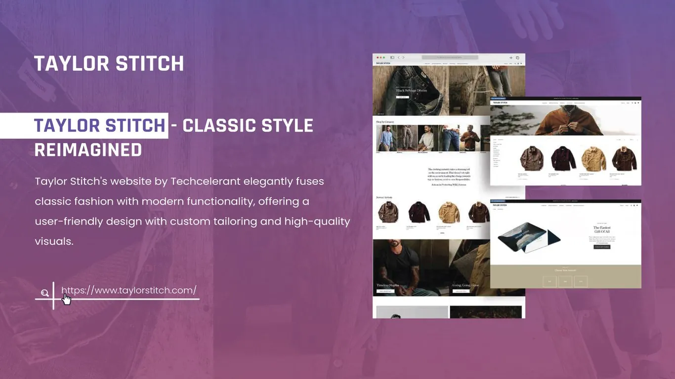
Taylor Stitch makes durable, classic menswear such as selvage denim, workwear jackets and shirts. Techcelerant designed and built its online store at taylorstitch.com. The store combines editorial photography with practical shopping tools: category browsing, a new arrivals carousel, filtered collection pages and a simple gift card flow.
The client
Taylor Stitch sells clothes meant to last for years. Its customers want quality fabrics, good fit and timeless styles, and they pay attention to how a garment is made. The brand also cares about responsible production, which it explains to shoppers directly on the site.
The problem
Classic menswear can look plain in a standard product grid. A brown jacket is a brown jacket until you see the canvas texture, the stitching and how it wears. The client's team needed a store that showed that detail, kept browsing fast for repeat customers, and made room for the brand's message about responsible clothing.
Gifting was another need. Many shoppers buy Taylor Stitch for someone else and are unsure about sizes. The store needed a clear path for those buyers.
What we built
We built a Shopify Plus store with a strong homepage and clean collection templates.
- A homepage hero that features one product story at a time, such as Black Selvage Denim, with full-width photography and a shop button.
- A Shop by Category row with photo tiles for shirts, pants, outerwear, knits and more, so returning customers can jump straight to what they need.
- A short brand statement in the middle of the homepage about the clothing industry's environmental cost and the brand's approach to responsible production.
- A New Arrivals carousel showing jackets and other recent pieces on clean backgrounds.
- Large editorial panels, including Timeless Staples and Going, Going, Gone, that lead to curated edits and last-chance items.
- Collection pages with a lifestyle banner, a sidebar filter list and an even product grid.
- A gift card page headlined "The Easiest Gift Of All," with a card image and a row of amount buttons.
Design decisions
We kept the interface quiet so the clothes could speak. The site uses white space, black text and thin rules. Color comes from the photography: the browns and indigos of the garments and natural outdoor settings.
The homepage alternates between dense and open sections. A tight row of category tiles is followed by a centered block of text, then a product carousel, then two large photo panels. That rhythm keeps a long page easy to scroll and gives each part a clear job.
Collection pages put filters in a left sidebar. Menswear shoppers often know their size and the type of garment they want, so a visible filter list saves them time compared with a hidden filter drawer.
The gift card page has its own soft khaki band and big amount buttons. A gift buyer can choose a value and check out in a few steps without worrying about fit. Our article on ecommerce product photography explains why consistent product shots matter on pages like these.
The result
Taylor Stitch now has a store that feels like the brand: confident, simple and focused on materials. Shoppers can browse by category, see what is new, filter a collection to their size and buy a gift card in a few clicks. The brand's message about responsible production sits on the homepage where every visitor sees it.
The client's team can swap the homepage hero, feature panels and carousels for each new drop, so the store stays current without new templates.
If your apparel brand needs a store that shows the quality of its products, see our ecommerce development service or contact us.