The Cliffs at LIC · Rock climbing gym
The Cliffs at LIC climbing gym website
Techcelerant built The Cliffs at LIC climbing gym website, with first-visit info, class schedules, membership details, yoga and Learn to Climb packages.
First published
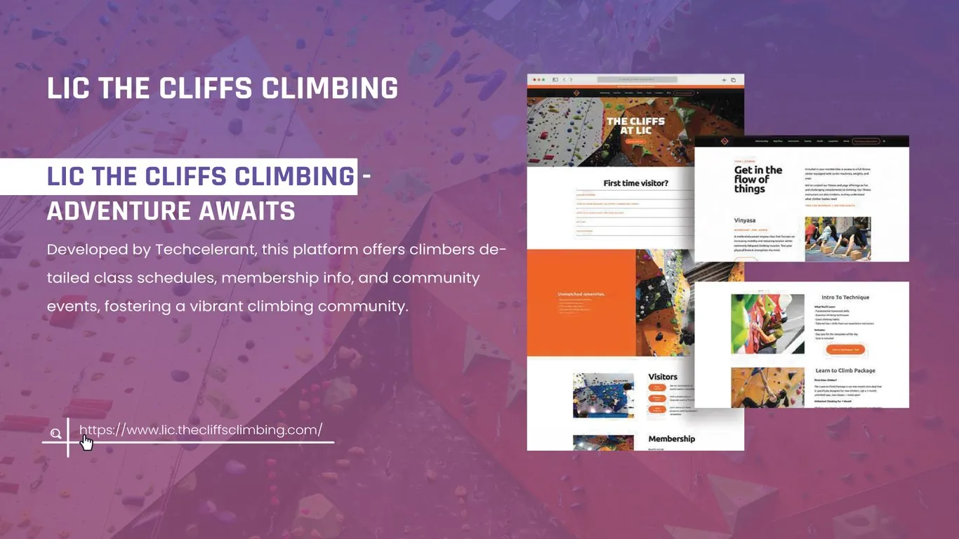
The Cliffs at LIC is an indoor rock climbing gym in Long Island City, Queens. Techcelerant designed and built its website at lic.thecliffsclimbing.com. The site helps first-time visitors plan a visit, shows regular climbers the class schedule and membership options, and gives the gym's fitness and yoga programs and community events their own pages.
The client
The gym serves a wide range of people. Some have never touched a climbing wall and want to try it with friends. Others climb several times a week and care about route setting, training areas and classes. The gym also runs yoga, fitness sessions and community events, so it is part climbing gym and part neighborhood fitness club.
The problem
New visitors have a lot of questions before they arrive. Do I need to book? What do I wear? Is there a waiver? Can I rent shoes? If the website buries those answers, people call the front desk or never come in.
At the same time, members need fast access to schedules, class details and membership terms. The client's team wanted one site that could welcome beginners and serve regulars without either group digging through content meant for the other.
What we built
We built a site with separate, clear paths for visitors and members.
- A homepage hero with a wide photo of the climbing walls, the gym name in bold white type, and a bright orange call to action.
- A First time visitor section right below the hero, set up as an accordion of common questions so visitors can open only what they need.
- An Unmatched amenities panel in solid orange with a short list of facilities, next to a photo of the colorful walls.
- Visitors and Membership blocks on the homepage, each with photos and orange buttons for day passes, rentals and joining.
- A yoga and fitness page headed "Get in the flow of things," with class descriptions such as Vinyasa and a schedule link.
- Class pages for Intro to Technique and the Learn to Climb package, each listing what you will learn, what is included and a button to book.
Design decisions
We chose orange as the main accent because the walls and holds at the gym are full of bright color, and orange stands out against both the white page and the photos. Buttons, section labels and key panels all use it, so visitors always know where to click.
Headlines use a heavy, rounded sans serif that matches the energetic feel of climbing. Body text is plain and set in short blocks. Class pages list skills and inclusions as bullets, because people compare packages by scanning down a list.
We put the first-visit questions near the top of the homepage. Most new visitors land there first, and answering their concerns early is the most direct way to get them through the door. The accordion keeps the section short for regulars who scroll past.
Each class gets its own page with the same layout: photo, description, what you will learn, what is included and a book button. When the gym adds a new class, staff fill in the same fields and the page looks finished. Our guide on website forms that convert explains how we think about the booking step that follows.
The result
The Cliffs at LIC now has a website that serves both new and experienced climbers. First-time visitors can learn what to expect and book a pass before they arrive. Members can check class details, read about yoga and technique sessions and find membership information quickly. The orange and white design matches the energy of the gym and carries across every page.
The client's team can add classes, update schedules and post community events through the editor, without design help.
If you run a gym, studio or activity center, see our web development service or tell us about your project.