Digital Dream Weavers · Beauty & skincare
Digital Dream Weavers organic skincare website
Techcelerant built a calm, botanical website for the Digital Dream Weavers organic skincare brand, with an About page and newsletter signup on every device.
First published
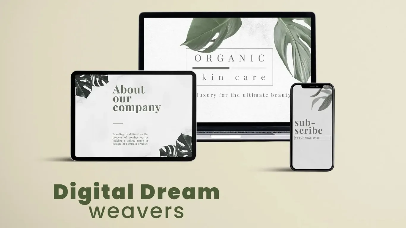
Digital Dream Weavers sells organic skin care positioned as everyday luxury. Techcelerant designed and built its brand website: a quiet, botanical site with a homepage that states the product line, an About page that tells the company's story, and a newsletter signup that works as well on a phone as on a laptop.
The client
The brand makes organic skin care for people who care about what goes on their skin and want the routine to feel like a treat. Its tagline, "luxury for the ultimate beauty," sums up the position. Shoppers in this category compare ingredients, read about the company behind the jar, and often sign up for updates before they buy. The site had to support all three.
The problem
Organic beauty is a crowded space. Many brands use the same pastel pinks and busy product grids, and their sites start to look alike. The client's team wanted a site that felt calm and natural, matched the premium price position, and gave visitors a reason to stay in touch.
They also had limited content at launch. There was a clear product focus, a short company story and a plan to build an email list. The design had to look complete with a small amount of copy, without filler pages.
What we built
We built a compact brand site with three core pieces.
- A homepage hero that reads "Organic skin care" inside a thin rectangular frame, with a short progress-style divider and the tagline underneath. Two large monstera leaves frame the text from the top corners.
- An About our company page with a large serif heading, a short rule and a block of justified body text. Smaller dark leaves sit in opposite corners so the page feels related to the homepage without repeating it.
- A newsletter signup screen, designed mobile first, with a stacked "sub-scribe" heading and a single email field labeled "to our newsletter."
- Responsive layouts for laptop, tablet and phone. Each device gets a layout built for its shape, so the tablet shows the About page in a wide format and the phone keeps the signup front and center.
Design decisions
We kept the palette to soft grays, a pale marble texture and muted greens. That combination reads as clean and natural, which is what organic skin care buyers look for. Bright accents would have pulled attention away from the product message.
Type does a lot of the brand work. The homepage title uses widely spaced capitals, which feel expensive and unhurried. The About page uses a high-contrast serif for headings and a smaller serif for body text. Serifs gave the brand a classic, editorial feel that suits a luxury product better than a geometric sans would.
The leaves are the one recurring image. Monstera leaves signal plants and freshness at a glance, and using them at different sizes and shades on each screen tied the pages together. We placed them at the edges so they frame the text and never sit behind it.
The newsletter got its own screen because email is how a young beauty brand builds repeat buyers. A single field with a short label keeps the signup quick. Our small business email newsletter guide covers what to send once people join.
The result
Digital Dream Weavers now has a website that looks like a premium organic brand and reads clearly on any device. Visitors can learn what the brand sells, read who is behind it, and leave their email address in a few taps. The client's team has a growing list of interested shoppers to contact about launches and offers.
The visual system is simple to extend. New product or ingredient pages can reuse the same gray backgrounds, serif headings and leaf accents, so the site can grow with the product line and still look like one brand.
If you run a beauty or wellness brand and need a site that fits your positioning, see our web development service or contact us.