

Lloyds Pharmacy · Pharmacy & Healthcare
Lloyds Pharmacy online pharmacy and online doctor website
Techcelerant built the Lloyds Pharmacy website: health products, an online doctor with treatment areas, video GP consultations and health advice.
First published
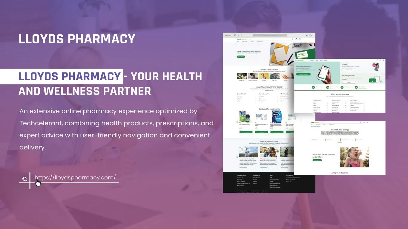
Lloyds Pharmacy sells health products online and offers prescriptions and treatments through its online doctor service. Techcelerant built a website that brings those parts together: a shop for everyday health products, an online doctor with consultations and treatment areas, and a library of expert advice. Navigation is simple, and delivery comes to the patient's door.
The client
Lloyds Pharmacy is a large pharmacy brand. Its customers range from someone buying cold and flu tablets to a patient starting a long-term treatment through an online consultation. Many of them arrive with a health question, not a product name, and they need to be pointed to the right place.
The problem
A pharmacy website does three jobs: retail, clinical service and information. Each one needs its own type of page, and each one has its own rules. When they live on separate sites, patients lose track of where to go, and the pharmacy loses the chance to help with the next step.
Lloyds wanted one website where a visitor could start from a symptom, a treatment or a product and end up in the right place. It also had to feel calm and trustworthy. People shopping for health products are often worried or unwell, and a cluttered page makes that worse.
What we built
- A homepage that opens with "Take control of your health" and a short line about getting care your way.
- An "Always here for you" row of photo shortcuts into the main areas of the site, such as allergy relief, pain relief and skin care.
- A "LloydsPharmacy Online Doctor" block that lists treatments in three columns: general health, women's health and men's health.
- Product carousels, for example "Cold and flu treatments," with product photos, prices and a green "View details" button on each card.
- An "Advice you can trust" section with articles written by pharmacists and doctors, on topics such as healthy habits and menopause.
- An online consultations page with an entry for video GP appointments and a separate path for returning patients.
- A "Select a treatment area" page that lists every condition the online doctor covers, grouped by category.
- Condition pages such as "Asthma and allergy," with a friendly headline ("We're here for the sneezers and sniffers"), filters and related treatments.
- A dark footer with customer service links, shopping categories, legal information and partner services.
Design decisions
We kept the palette close to the brand: white pages, green buttons and green icons. Green marks every action, so a visitor always knows where to click. The rest of the page stays quiet so health information is easy to read.
The site sorts care the way patients think about it. The treatment picker groups conditions by general, women's and men's health. Someone looking for help with a sensitive problem can find it in one look without searching for a medical term.
Each section follows its own pattern. Shop pages use product cards with a photo, a name, a price and one button. Online doctor pages lead with the consultation options. Advice articles use larger photos and short summaries. Because each type looks different, visitors can tell whether they are shopping, booking a consultation or reading.
Condition pages connect all three. The asthma and allergy page explains the condition, links to treatments through the online doctor and shows related products. A patient can learn, consult and buy from one starting point.
Photos show real people in ordinary moments, like a child sneezing or a person walking outdoors. That keeps the site warm without leaning on clinical imagery.
The result
Lloyds Pharmacy now has one website for shopping, online consultations and health advice. A visitor can start from a condition, a treatment area or a product and reach the right page. Returning patients have their own path back into the online doctor. The client's team can add treatments, products and articles inside a structure that already has a place for each.
Large sites live or die by their menus. Our guide to website navigation best practices explains how we plan them.
Building an online store for health products or services? See our ecommerce development service or contact us.


